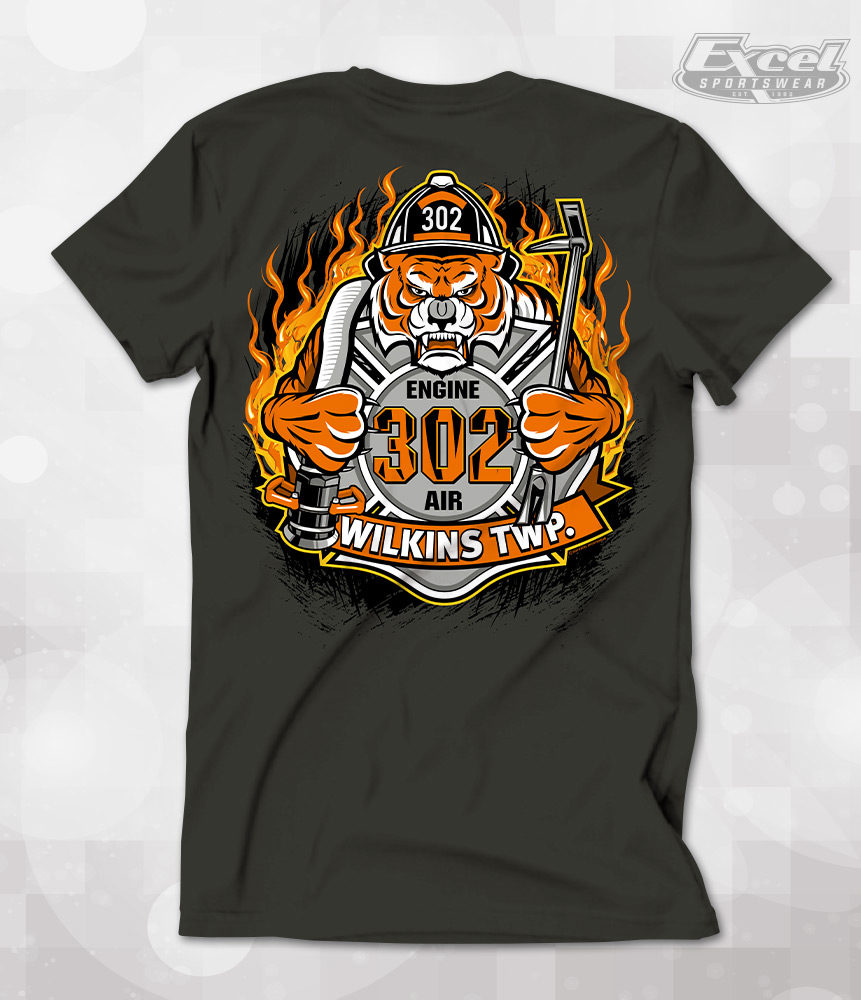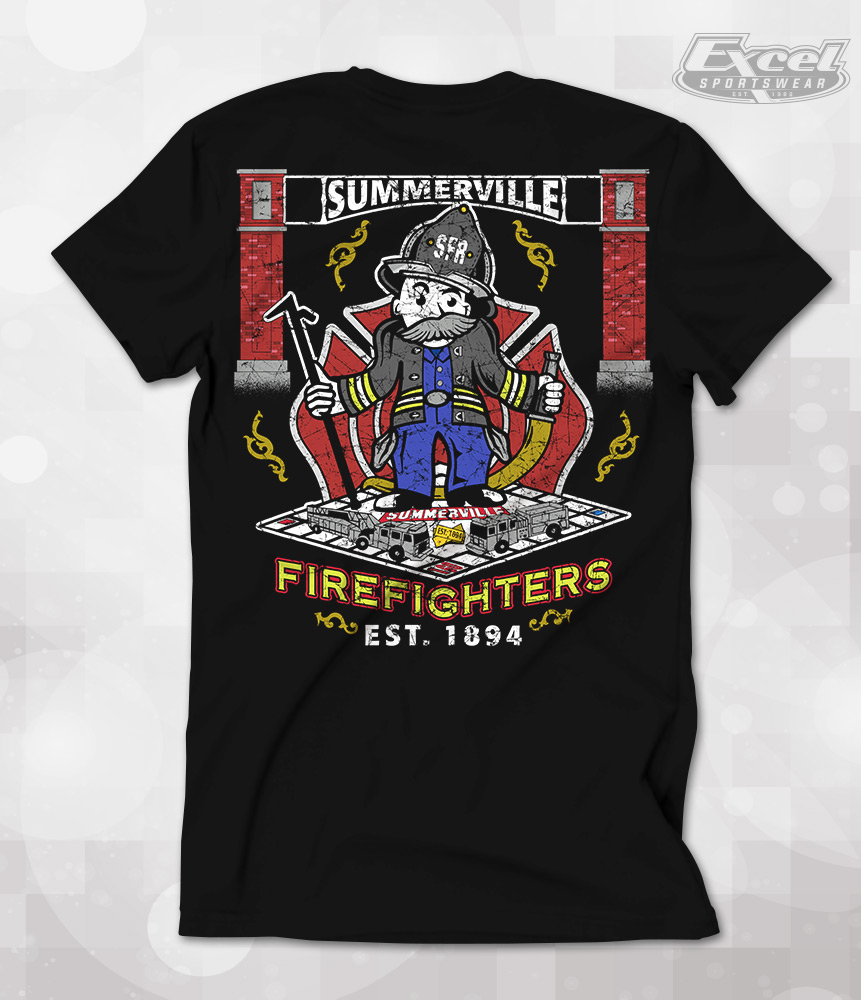
Since many of our customers are unfamiliar with some of the screen printing terminology we sometimes use, we’d like to clarify the jargon of two printing techniques by providing some visual examples. Here is the difference between greyscale vs tonal.
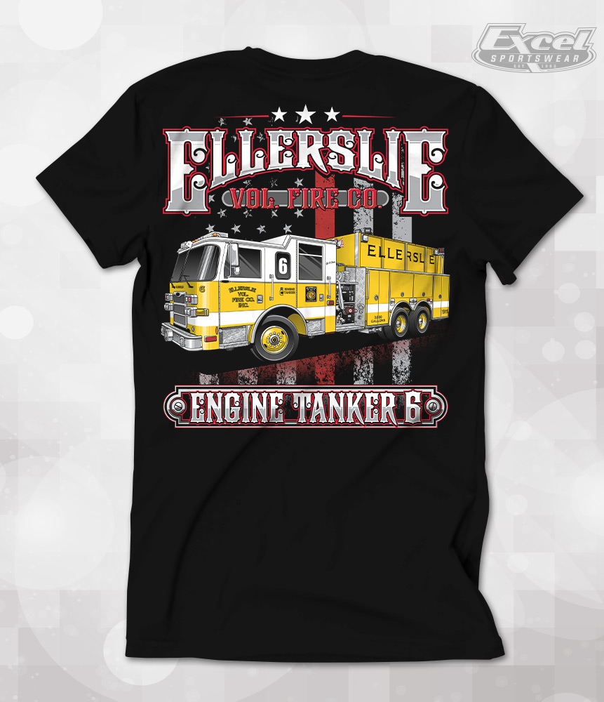
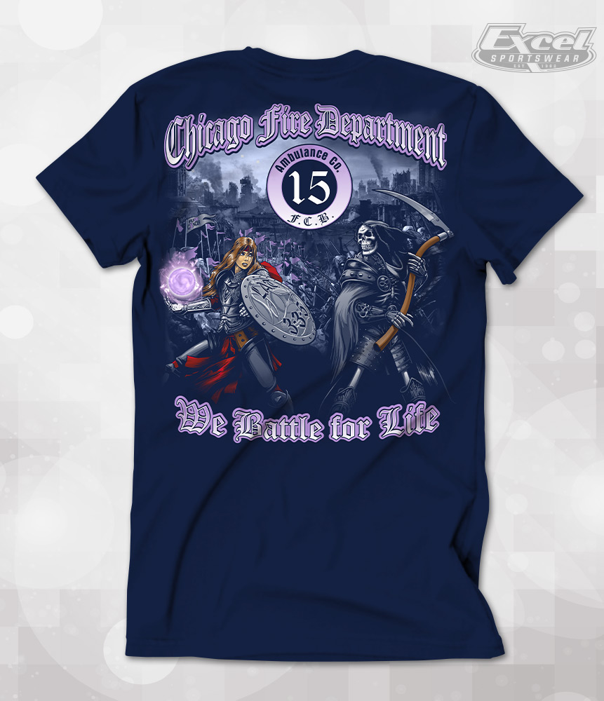
A “tonal” technique of screen printing means one color, typically white, is used to create the image on the t-shirts. The varying shades of the print are created by controlling the amount of ink used in each specific part of the artwork.
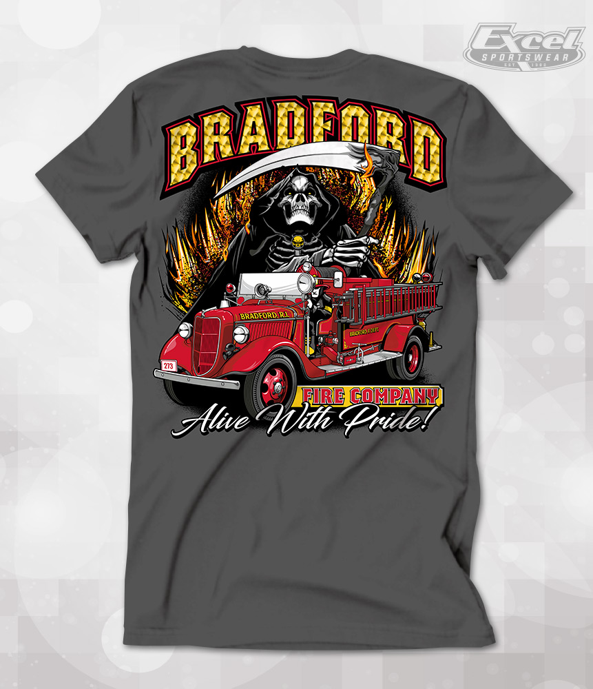
Because of the limitations of this tonal technique, we only recommend tonal printing on a few select shirt colors. These colors are on the dark end of the spectrum, specifically black, navy, dark chocolate, and forest green. Other darker colors like charcoal, dark heather and olive may work, but final results will vary. [Note: Names of the colors will be different between each shirt manufacturer.]
As you can see by the examples below, the white tonal technique produces images that will look different and adopt some of the qualities of the color of the shirt. Parts of the image that appear white on a black shirt now have a blue tone on a navy shirt, green on forest green, etc.
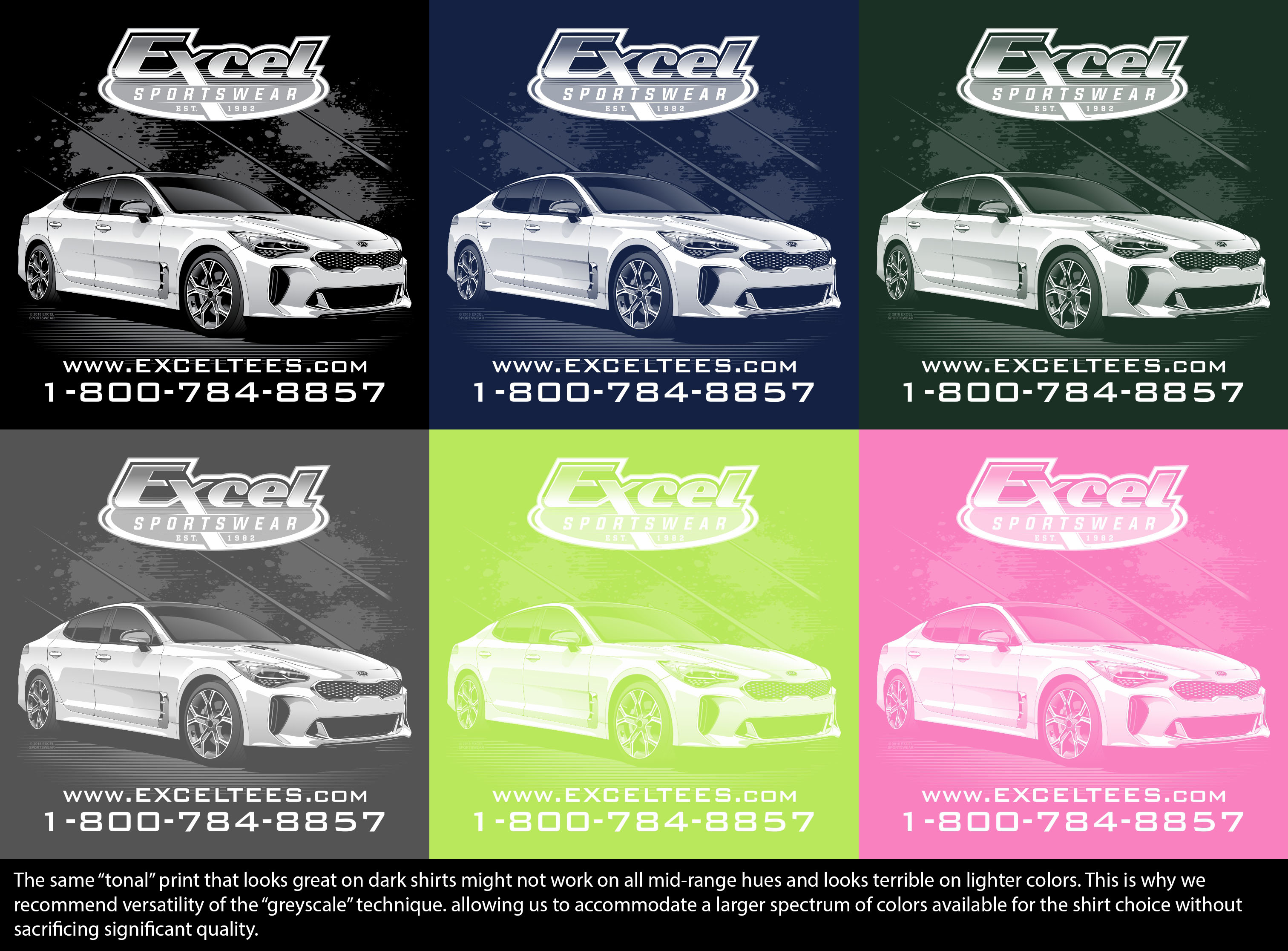
If we print that same tonal design on a lighter color garment, the final product would be less than desirable. Not only is the white ink harder to see on the lighter shirt, but the blending of the shades is harder to achieve because of the lack of contrast.
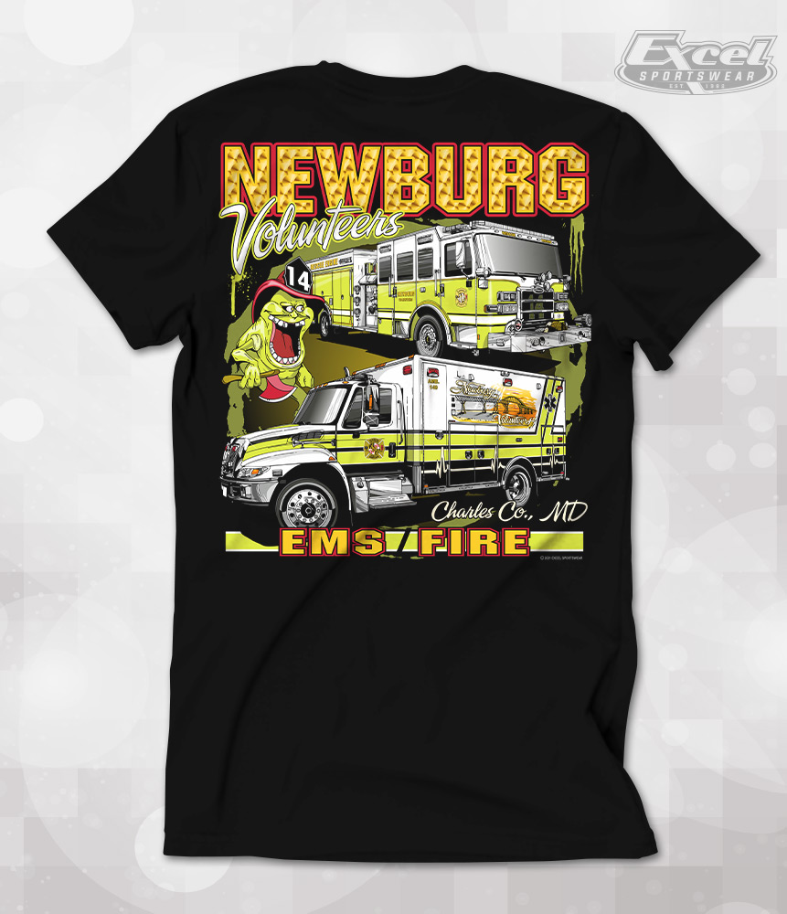
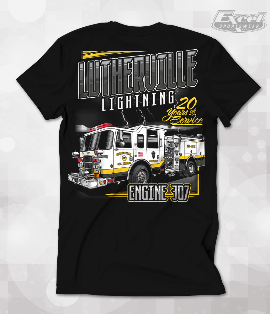
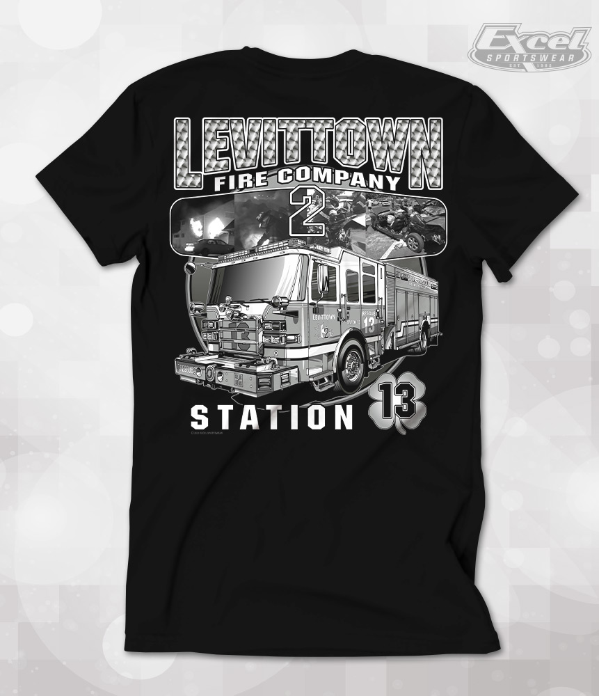
Since we want our customer’s artwork to look as good as possible and we want all shirt colors to be available, we highly recommend using a “greyscale” technique.
The greyscale technique uses black, white and grey as the primary ink colors in the printing. The versatility of the greyscale technique allows us to accommodate a larger spectrum of colors available for the shirt choice without sacrificing significant quality of the printed artwork design.
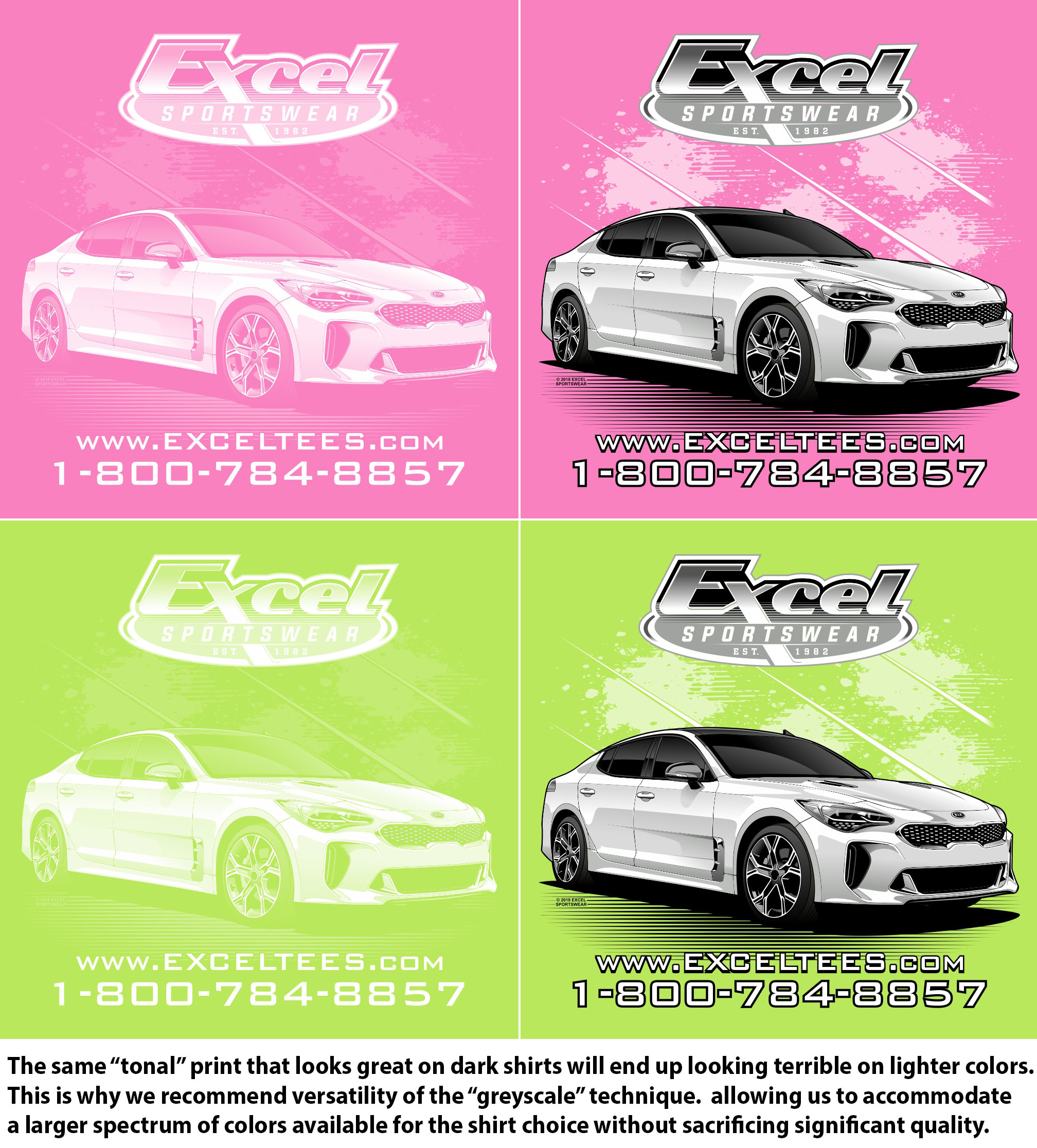
As you can see by the examples above, the shirts produced with the greyscale technique creates a print that is much easier to see on lighter shirts. Logos are more defined, you can see a more true image, and text can be read more clearly.
In summary, a tonal technique can give you a nice, vintage look on a few limited options of darker colored shirts. For a design that will look bold and consistent on shirts of all colors on the spectrum, a greyscale technique is your best choice.